Full-court miracle
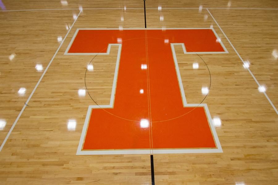
Tiger Center gets revamped with new basketball court design
Photo by Lauren Gibbert
September 12, 2014
The squeak of rubber soles, the smack of hands against a basketball and the roar of cheering fans– the gym is home to it all. Due to the out-of-date design of the main floor, Tiger Center’s court was redesigned and refinished this summer.
“This project was part of the annual maintenance of refinishing our gym floors,” said Casey Nichols, executive director of support operations. “Since the competition floor’s lettering and color was faded and worn, it was time to update.”
Although administrators are pleased with the outcome, some students seem to be having mixed emotions.
“I like the new wood paneling, but I think the detail and design of the old floor was better,” sophomore volleyball player Skylar Huddleston said. “The tiger was my favorite, to me it looked nicer than just a letter.”
Many claim to have preferred the tiger as the center aspect of the court rather than the new “T” logo.
“When we line up along the net, you can see that the ‘T’ is slightly uneven,” Huddleston said.
Whereas volleyball players see the nicer paneling stain, along with an uneven center design, basketball players have different thoughts that seem to be nothing but good.
“I think it’s awesome,” senior Laken Edwards said. “It’ll be nice having a darker stain inside the three point line.”
These athletes not only enjoy the new design, but look forward to many games on the up to date court.
“I am ready to play ball on the new court,” sophomore Carson Jones said. “It looks more like a college floor rather than a high school floor, and I like that a lot.”


